CASE STUDY · 0→1 PRODUCT · 2026
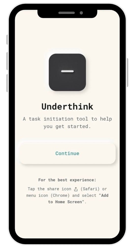
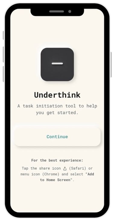
Underthink
A task initiation tool for neurodivergent and overwhelmed minds. Built solo. Shipped live.
ROLE: Strategy · UX · Front-End Dev
TIMELINE: Jan 2026 — Ongoing
PLATFORM: PWA · Mobile & Desktop
STATUS: Live MVP · v1.1 in development
"I finally did my laundry." — actual user, actual laundry, actual win.
7/10
users reported a positive experience in early testing
1
person finally completed a task they'd avoided for 13 days
0
accounts required · no data collected · no cloud dependency
01 — THE PROBLEM
The hard part isn't doing the work.
This project started with a specific, recurring experience: knowing exactly what needed to be done, and still not being able to start. Not a motivation problem. Not a time problem. An initiation problem.
Every productivity tool available — calendars, task managers, AI planners — shared the same structural assumption:
"The hard part is execution."
For a significant portion of people — those with ADHD, burnout, anxiety, chronic overwhelm — that assumption is wrong. The hard part is touching the work at all.
Existing tools fail this group in three consistent ways. Calendars require planning as a prerequisite — which is exactly the step being avoided. Task managers focus on organisation and completion, not the moment before either. AI planners add abstraction and configuration overhead — the opposite of what a dysregulated brain needs.
"I knew that time blocking would help manage my ADHD — but I couldn't get myself to sit down and plan my day."
— The starting point for Underthink
The gap between knowing what to do and being able to start — no tool was designed to bridge it. That gap became the product.
02 — THE REFRAME
Most productivity tools optimise for execution. Almost none optimise for entry.
The design question was deliberately reframed before a single screen was drawn. Not "how do we help users manage tasks better?" but: "how do we help someone touch one task — just once — without planning, without a system, without pressure?"
That distinction — optimising for entry rather than execution — became the foundation of every decision that followed.
This led to a single guiding principle that acted as a filter for every feature, interaction, and line of copy:
"The app should reduce decision-making — not add structure."
From this principle, a set of hard constraints emerged naturally. These became the product's identity:
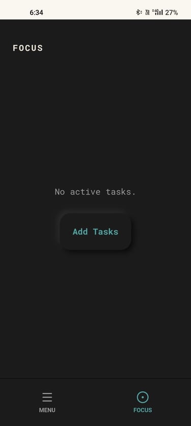
No visible full task list
No calendars or time blocks
No priorities, scores, or streaks
No requirement to plan before starting
No AI in v1 — rule-based and emotionally safe
03 — DESIGN PRINCIPLES
Five principles. Every feature earns its place.
Before any wireframe was drawn, five principles were defined as decision filters. A feature that violated more than one was cut — regardless of how useful it seemed.
01
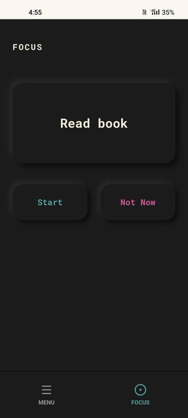
Initiation over completion
The product's value lives in the moment of starting — not in tracking whether you finished.
02
One decision at a time
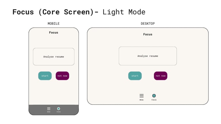
Cognitive load is reduced by constraining choice, not expanding it. One task. Two buttons. That's it.
04
Calm over control
The emotional tone of the product matters as much as its functionality. It must feel relieving, not demanding.
03
Avoidance is information, not failure
When a user doesn't act, the system treats that as data about the task — not a character judgment.
05
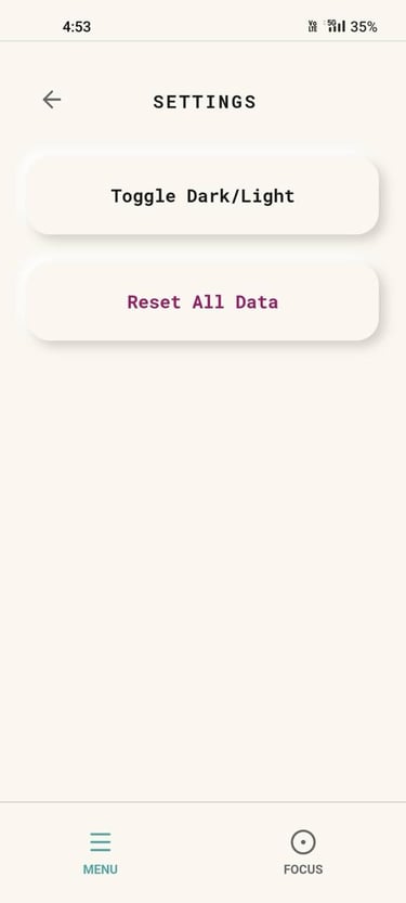
Local-first and private by default
No accounts, no data collection, no cloud dependency in v1. Your brain dumps stay yours. Trust is the product's most valuable asset.
04 — DESIGN PROCESS
Wireframes & Screen Architecture
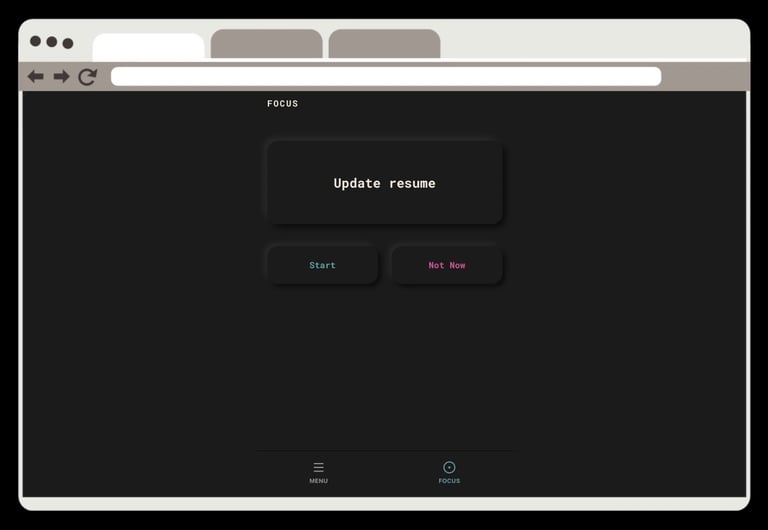
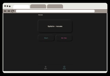
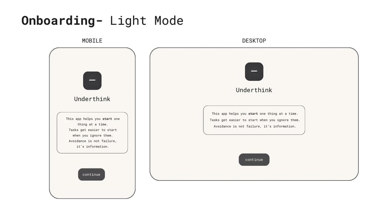
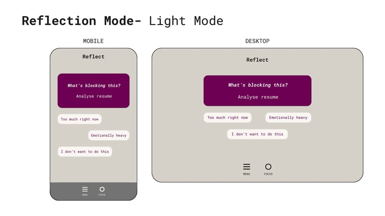
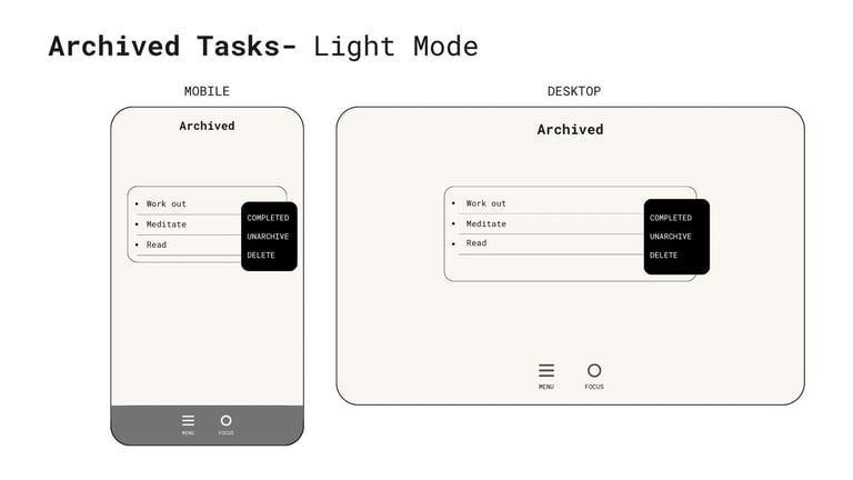
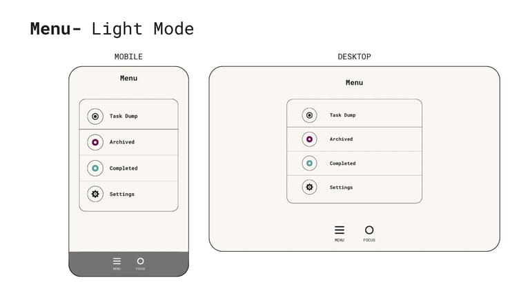
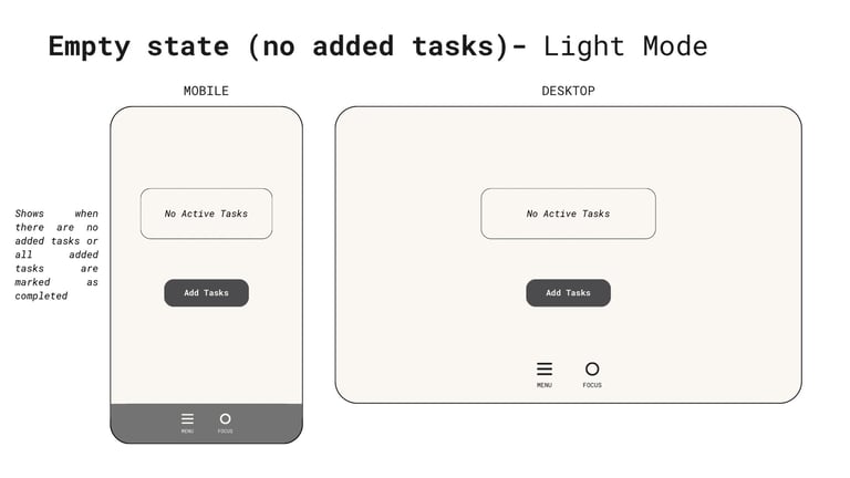
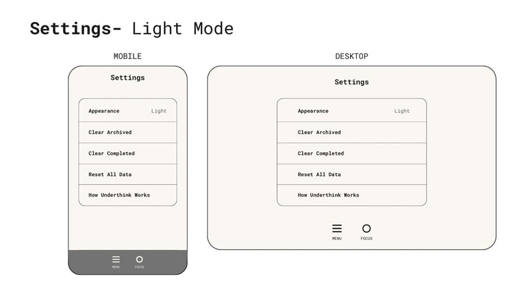
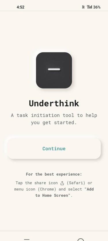
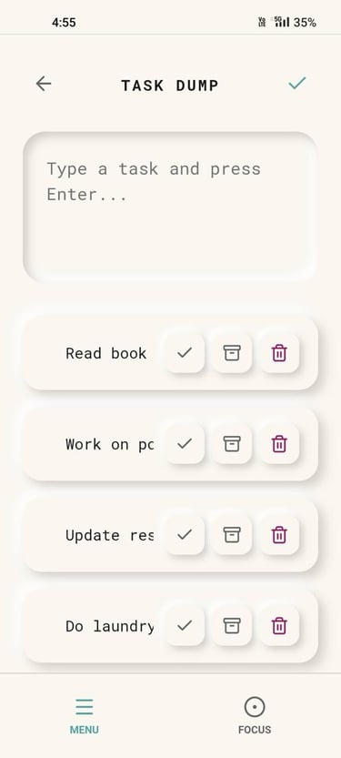
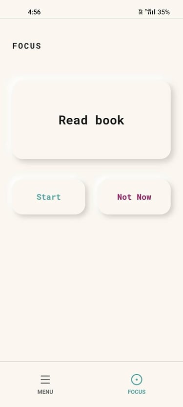
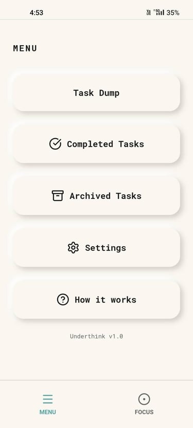
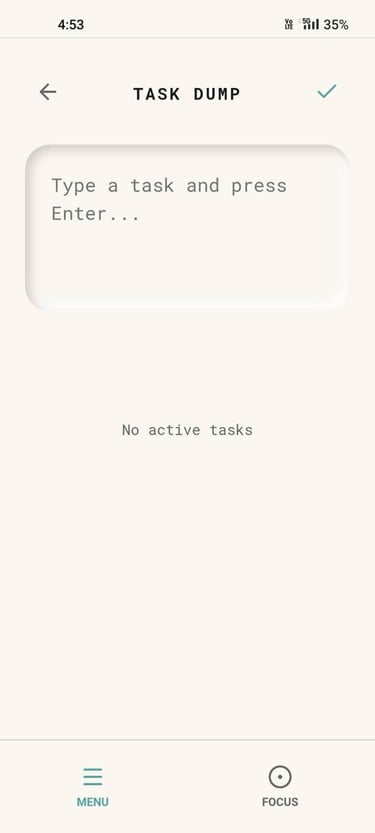
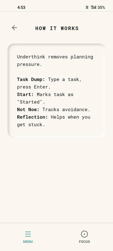
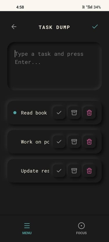
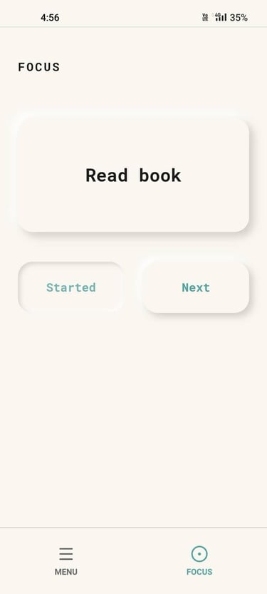
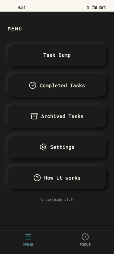
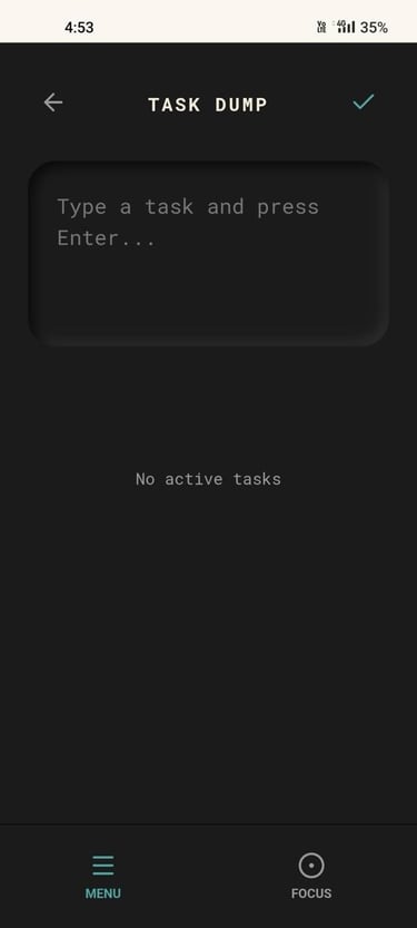
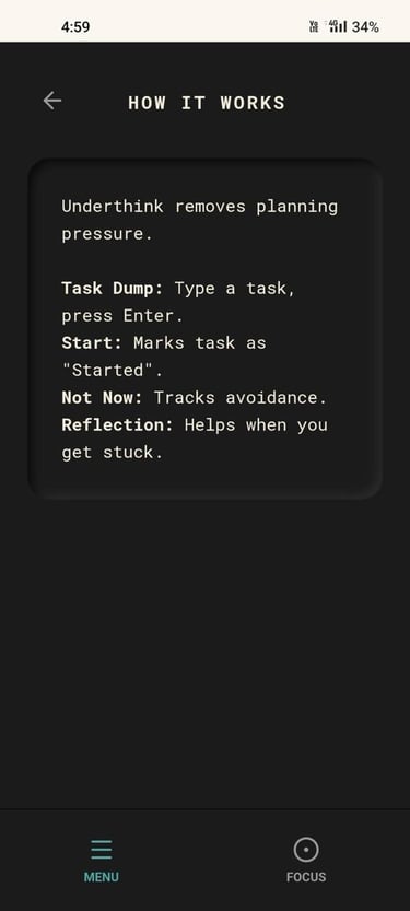
Every screen in the product earns its place. The product is intentionally lean: Task Dump, Focus, Start Acknowledgement, Reflection Mode, Menu, Archived, Completed, Settings, and Onboarding. Each one serves a single, non-negotiable function.
05 — LIVE PRODUCT
The app, deployed.
The front-end logic was personally built to ensure fidelity between prototypes and the deployed product. Neumorphic UI, typewriter fonts, cream-on-dark palette — every visual decision is grounded in the product's emotional positioning.
The visual language is neumorphic by deliberate choice — not aesthetics. It reduces visual aggression, avoids harsh hierarchy, and aligns with the product's emotional positioning. A dysregulated brain doesn't need another high-stimulus interface.
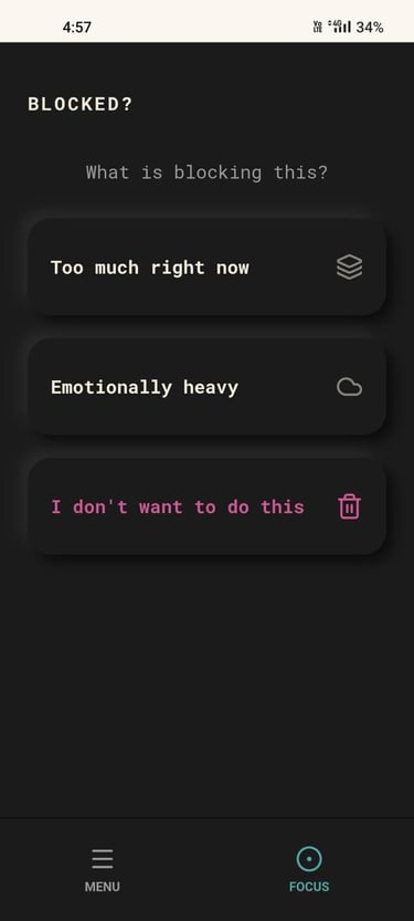

06 — CORE SYSTEM
The Task Shrinking System
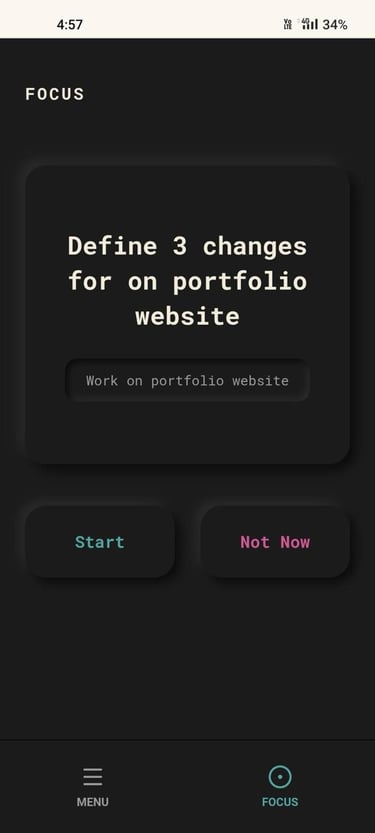
This is the product's core differentiator. When a task is repeatedly avoided, it doesn't escalate — it simplifies. Shrinking is triggered by passive avoidance, not explicit rejection. The distinction is critical to the product's emotional safety.
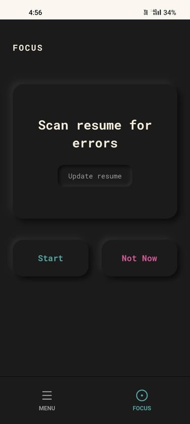
LEVEL DESCRIPTION EXAMPLE: "FIX RESUME"
Level 0: Original task- Fix resume
Level 1: Safe entry action- Define what needs changing in the resume
Level 2: Easier entry action- Identify 3 errors resume
Level 3: Minimal effort action- Just open the resume file
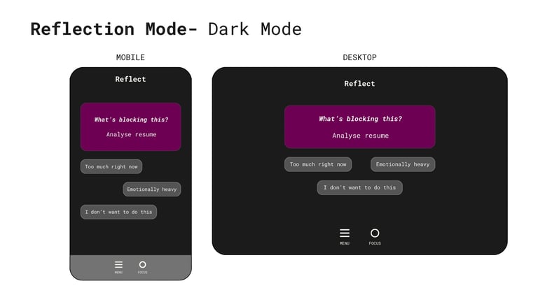
Level 4: Reflection Mode triggered- What's blocking this?
Shrinking uses a grammatical extraction heuristic — tasks are parsed as [Action] + [Object] and the object is dynamically injected into shrink templates. "Fix resume" becomes "Just open the resume file." The app appears to read your task, which creates stronger psychological permission to follow the instruction.
WHAT TRIGGERS SHRINKING
→ Closing the app without acting
→ Seeing a task multiple times without tapping
→ Tapping "Not Now" repeatedly
07 — KEY DESIGN DECISIONS
Every no is as important as every yes.
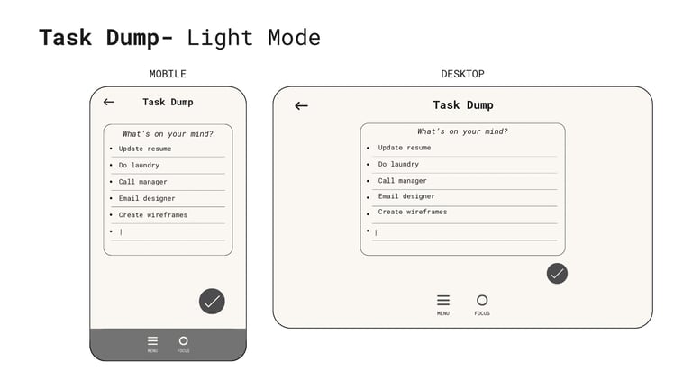
Why hide the full task list?
3/10 early users asked for it. The decision was to not build it. Showing everything at once is the core problem Underthink exists to solve. A full list view would undo the product's primary intervention. Users who want that already have Notes app and Google Keep — this isn't competing with them.
Why Neumorphism?
Deliberately researched, not a trend choice. Neumorphism reduces visual aggression, avoids harsh hierarchy, feels tactile and calm, and aligns with the product's emotional positioning. A dysregulated brain doesn't need another high-contrast, high-stimulus app.
Why no analytics or streaks?
Streaks, scores, and performance dashboards create exactly the kind of pressure that shuts down the users this product is designed for. Success is qualitative: does the user start something? Do they come back voluntarily? Do they feel relieved — not monitored?
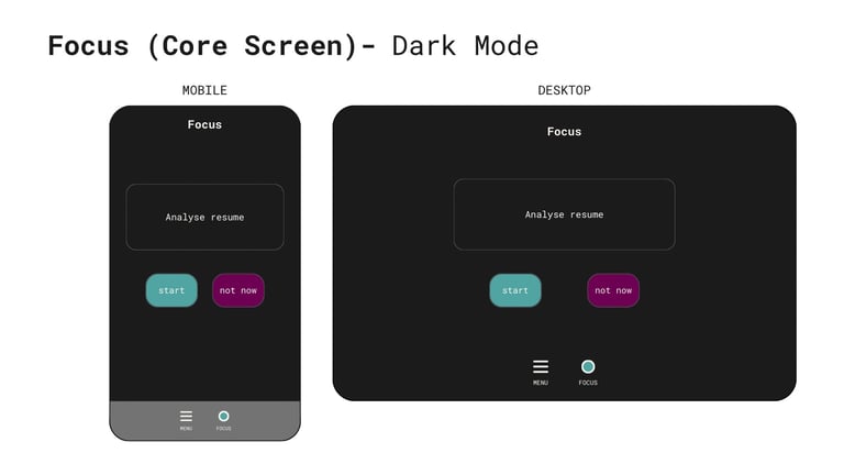
Why does Start not auto-complete a task?
Because "Start" and "Complete" are different things. Users can tap Start on the same task 5 times over 5 days without losing it, preventing the "accidental completion" anxiety common in ADHD tools. The task stays in rotation until the user manually marks it done.
08 — SCOPE DISCIPLINE
What got cut — and why.
Early versions included time blocking, task breakdowns, adaptive notifications, and long-term planning. Each was intentionally removed — not because it was hard to build, but because it reintroduced the cognitive load the product was designed to eliminate.
Home screen widget
DEFERRED → V1.1
Highest-requested feature across early testing. Technically complex for PWA architecture. Confirmed for the Android build in v1.1 — it's not gone, just sequenced correctly.
AI task shrinking
DEFERRED → FUTURE
Too unpredictable for a product built on emotional safety. Rule-based shrinking is transparent, reversible, and emotionally safer. AI is deferred until the core system is validated.
Calendars & time blocking
CUT ENTIRELY
Reintroduces planning as a requirement — which is the exact friction the product exists to remove.
Cross-device sync
DEFERRED → FUTURE
Introduces backend complexity and the privacy concerns that are out of scope for v1. Local-first is a principle, not a limitation.
Analytics & streaks
CUT PERMANENTLY
Performance pressure is antithetical to this product's emotional positioning. If users feel watched, the product fails.
"I finally did my laundry."
User with ADHD · Task avoided for 13 days · Completed after using Underthink once.
"Can I un-press Start? I tapped it by accident."
Multiple users · Now in the backlog for v1.1 · Should have been anticipated.
WHAT WORKED
The core loop resonated. People understood the "one task at a time" model immediately. The calm, minimal UI was consistently described as "not stressful" — which, for this user group, is exactly the goal.
"I want it on my home screen. Not as a bookmark — as a widget."
Most-requested feature · Unprompted · Confirmed for Android v1.1
09 — USER FEEDBACK
10 people. Real feedback. No filter.
WHAT TO IMPROVE
Onboarding needs to explain the shrinking logic more explicitly. The mental model of "avoidance as information" isn't immediately intuitive — it needs to be surfaced earlier, more clearly, and with less assumption.
10 — ROADMAP
What's next.
V1.0 · LIVE
Web App (PWA)
Full core feature set
Local storage only · no backend
Responsive · mobile + desktop
No login required
Live at underthink.in
V1.1 · IN DEVELOPMENT
Android App
Home screen widget (most requested)
OS-level notification toggle
"Undo Start" interaction
Improved onboarding flow
FUTURE
Considered, not promised
iOS native app · one-time purchase
AI-assisted entry point generation
Optional cross-device sync
No subscriptions · no ads · ever
11 — HONEST REFLECTION
What I'd do differently.
01
Onboard more explicitly around the core mental model. "Avoidance is information" sounds obvious once you understand it — but it needs to be taught, not assumed. The current onboarding is too sparse.
02
Build the "undo Start" interaction from day one. The request came up immediately across multiple users. It should have been anticipated — it's a basic safety net for an interaction that has real emotional stakes.
03
Test with more neurodivergent users earlier. The product's primary user group was the inspiration for it — they should have been in the feedback loop from the start, not just the validation phase.
04
Collect real usage data — even minimal telemetry like return visits and task start rate — so iteration is grounded in evidence, not intuition. The current absence of metrics is principled but limiting.
Underthink is intentionally small. Its value doesn't come from what it adds — it comes from what it removes.
The pressure to plan. The guilt of avoidance. The need to look at everything at once. The product succeeds if users start without planning, if avoidance decreases over time, and if the experience feels relieving — not impressive.
NEXT CASE STUDY
Grid & Grain Studio